Scenic Design
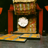
In working with John Hofland, we had done a number of shows together and the collaboration was delightful once again. John brought some new inspiration to the scenic design. He and his wife had been invited to an afternoon barbeque at a neighbor’s, and they taught him about the Jewish tradition of the harvest tent. This was a temporary structure that was built during the week-long festival of Sukkot. He was intrigued by the use of natural items to build and decorate this tent that was used for not just eating, but also sleeping and celebrating. So, he wanted to create a sort of tent for the performance to happen under. With my love of Anita Diamante’s book The Red Tent, I was delighted with the concept. He combined the use of natural fibers and warm colored fabric drapes to create our scenic tent. The tent was open for the audience, inviting them to be a part of the story-telling celebration. There was elegance to the rich red colored drapes that framed the set nicely. I was also craving multiple levels to direct and choreograph with, so we had three platforms that moved from down right, up mid right, and high center with the circular logo. A larger logo was created to match the size of the theatre, and for years both of them lived in my studio building. We decided to have the two musicians under the red drapes on either side of the stage framing the actors.
This created a challenge for them to be able to synchronize their sounds and work, but they became quite adept and it was fantastic having live sound surround the performing area. They had a variety of drums and percussion instruments, along with chimes and a xylophone. The platforms were treated to look like a warm parquet wood floor framed with black edges. One of the main elements of the set that really pulled it together for me was that the back drape behind the logo was of mesh and had grasses woven into it, but also photos of women. Summer, the costumer, screen printed various photos of women’s faces, using a sun process to create the images. They were of women of importance through history such as Mother Teresa and Rosa Parks. Everyone involved with the show could also turn in photos of important women in their lives and their faces were included. It was powerful to have my mother and mother-in-law represented in the set in that way. It wasn’t super obvious, they were woven into the fabric in such a way you were aware there were faces of women, but you couldn’t really decipher much more. But it did feel like the sisters, mothers, and grandmothers of the past and present came together witnessing the performance.
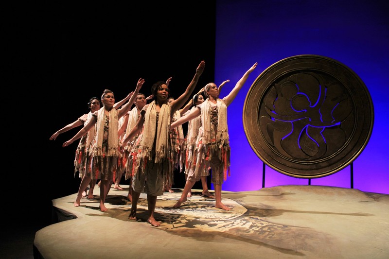
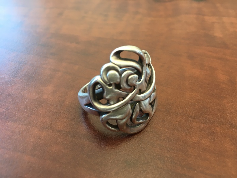
Part way into the process of the 2015 costume design, Courtney Smith joined our Department as our Scenic and Lighting Designer. I shared with him the other set images which had come to me that Spring, one of which was the location of Golgotha (the hill where Jesus was crucified), and I wondered about using the medallion as an image of being a sun and moon. I liked the idea of the sun or the moon being the same sun and moon that these actual women from the stories lived with as well. Strange to think how separate our lives are and yet how connected under the same forces of night and day. I shared the structure of the piece that really called for a unit set that could be many different locations as the stories unfolded. I also shared the importance of the medallion, which at that point I was still referring to as a logo. I was thrilled when he came up with the term medallion, which we have used ever since. A medallion is typically metal or wood and so that guided his design. In 2006, however, my students had presented me with a medallion of my own. A silver version of the image for Weaving Our Sisters’ Voices.
When Courtney and I next met I was anticipating the regular design process where he shows some ideas, we discuss, and he goes away and brings back more. Well, at this meeting he reminded me that the semester was beginning right away and we didn’t have the luxury of this long process. Courtney had mocked up a set already, and the truth was, I really liked it, so we went for it.

The 2015 cast dancing on the sloped stage constructed for the performance. Photo courtesy of Leslie Stamoolis and Courtney Smith.
Our theatre for the 2010 and 2015 performances had the stage on the floor and the audience seating climbs from there. But it also has a very high performance space, so providing levels for the performance adds much. Courtney Smith, the scenic designer, created the multi-level and sloped stage which was a great challenge for the students at first. I was fascinated at how, when I was sitting in the audience directing them, I didn’t understand why doing a simple turn or kneeling would be such a problem until I got up and tried to demonstrate it for them on the sloped stage. It gave me a new appreciation for the work they were doing.
Suzanne Ostersmith


